

BRAND IDENTITY / ALASKA
TAP tubes
TAP back
to nature.
A nature-led identity for a new
perspective on packaging.
01 / OVERVIEW
Paper-based packaging.
A practical alternative.
TAP Tubes is an Anchorage-based packaging company developing paper-based tubes for food and pharmaceutical packaging, with B2B candy and pharmaceutical brands as its target customers.
I helped shape the product and its market positioning from an early stage, then translated that direction into a cohesive brand identity and communication system.
THE PRODUCT BEHIND THE BRAND
Paper at the center.
The packaging combines kraft paper tubes (90%) with polypropylene caps (10%) in a twin-tube construction.
02 / ROLE & STRATEGY
Shaping the product.
Defining the brand.
I joined before the product design was finalized. Working with the founder, I contributed to usability, defined the target audience and brand value, and helped shape visual direction, sales messaging and channels.
THE MARKET OPPORTUNITY
Close the cost gap.
The project’s competitive assessment identified mostly plastic child-resistant tubes and costly paper-based alternatives. TAP’s opportunity was to offer paper-based materials and child resistance at a more competitive price.
THE DIRECTION
Natural. Clear. Confident.
Make the environmental value visible, the opening mechanism understandable and the business case clear. Pair a nature-led visual identity with practical information for B2B packaging buyers.
POSITIONING / THREE CONNECTED ADVANTAGES
Environmental value.
Lead with the paper-based construction and the environmental value of its materials.
Child resistance.
A distinctive tapping action and twin-tube construction make child resistance central to the product experience.
TAP to open. TAP to close.
Competitive pricing.
Make the cost advantage over comparable paper-based child-resistant tubes a clear reason for B2B buyers to consider TAP.
PRODUCT FEEDBACK IN PRACTICE
Making the cap
easier to refit.
I identified that opening the tube reduced the clearance between its inner and outer tubes, making the cap difficult to refit.
My feedback informed a revised cap and tube structure that preserved space for the cap after opening.
The revised structure was designed to help the cap seat more easily when closing.
ROUTE TO MARKET
Build confidence for buyers.
I helped identify priorities to investigate: design and utility patent protection, child-resistant testing and food-contact compliance for intended markets, including relevant FDA requirements.
These describe planning priorities, not a claim that patents, testing or regulatory approvals have been obtained.
COMMERCIAL CONTEXT
Make the material choice relevant.
I connected the target audience and pricing advantage with sales channels, relevant events and trade shows. Market planning also considered plastic-related taxes and recycling policies as potential drivers of interest in paper-based packaging.
03 / IDENTITY
One recognizable
visual language.
The identity turns the positioning into a clear visual language: green and organic forms express nature, while the TAP wordmark makes the product’s opening and closing action memorable.
BRAND MESSAGE
TAP back to nature.
Rooted in nature, designed for protection. Paper-based materials, child resistance and competitive pricing in one tube. TAP to open. TAP to close.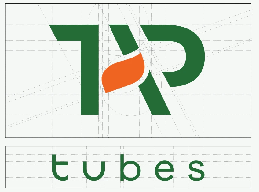
THE MARK
Nature in its form.
Action in its name.
TAP as a visual cue
The name highlights the opening and closing action.
Nature-led symbolism
Organic forms express the environmental focus.
A nature-led palette
Green emphasizes the connection to nature.
SECONDARY LOGO & VISUAL EXTENSION
From a symbol
to a visual language.
The secondary logo’s leaf-shaped silhouette becomes the foundation for a richer botanical expression. Layered leaves, branches and a spectrum of greens extend the same form into a distinctive brand graphic.
A palette drawn from nature.
A spectrum of greens reinforces the brand’s connection to nature and environmental responsibility, while orange brings contrast and emphasis.
Digital palette presentation. Final production values should follow the master artwork.
TYPOGRAPHY
Yantramanav
A straightforward sans serif supports the identity with clarity and an open, approachable rhythm.
ABCDEFGHIJKLMNOPQRSTUVWXYZ
abcdefghijklmnopqrstuvwxyz
0123456789
04 / APPLICATIONS
The brand,
out in the world.
The visual system extends across print, product photography and social media. Each touchpoint brings the nature-led identity into a clear, recognizable brand experience.
01 Print communication
Product information and brand storytelling in a shared visual language.
02 Product art direction
Natural settings connect the material story with the brand’s visual world.
03 Social media
The palette, imagery and botanical graphics carry through the profile, story highlights and post grid.
DESIGN RESOLUTION
A clear point of view.
A connected system.
From early product feedback to the final applications, the project connects usability, commercial positioning and visual identity in one consistent story for B2B buyers.